Data Mining with Kaggle YouTube Videos and Channels Metadata
Github Link
Data-Mining-with-Kaggle-YouTube-Videos-and-Channels-Metadata
Dataset
YouTube Videos and Channels Metadata
Usage
1. Create Enviroments
Windows
1
2
3
4
python -m venv venv
venv\Scripts\activate
pip install -r requirements.txt
jupyter lab
2. Download Dataset
- Download dataset from YouTube Videos and Channels Metadata
- Put
YouTubeDataset_withChannelElapsed.csvunder source folder
3. Open data-mining.ipynb On Jupyter
Processing
1. Data Preprocessing
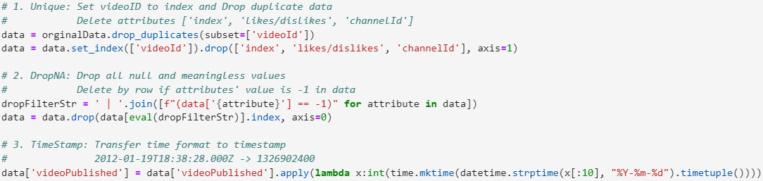
Unique: Set videoID to index and Drop duplicate data
- Delete attributes [‘index’, ‘likes/dislikes’, ‘channelId’]
DropNA: Drop all null and meaningless values
- Delete by row if attributes’ value is -1 in data
TimeStamp: Transfer time format to timestamp
- 2012-01-19T18:38:28.000Z -> 1326902400
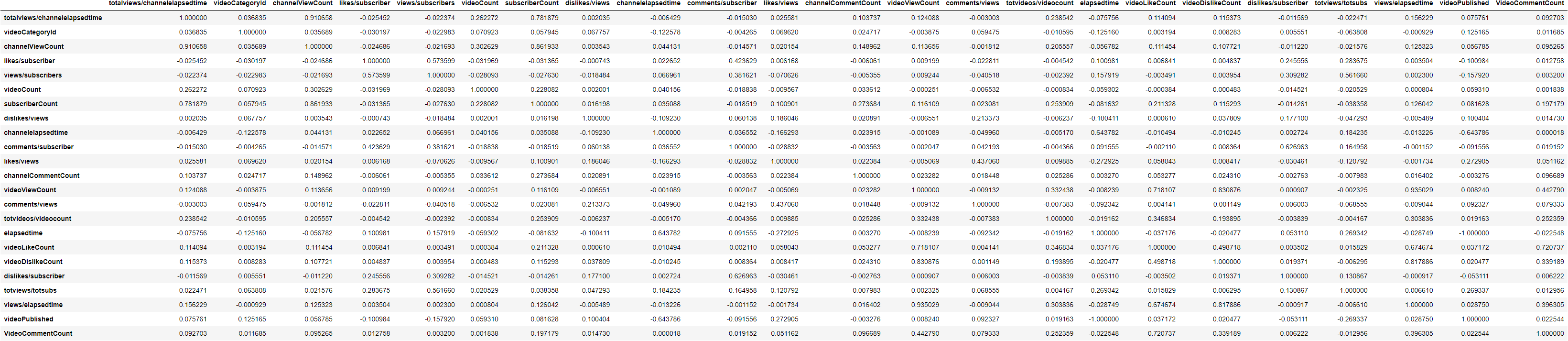
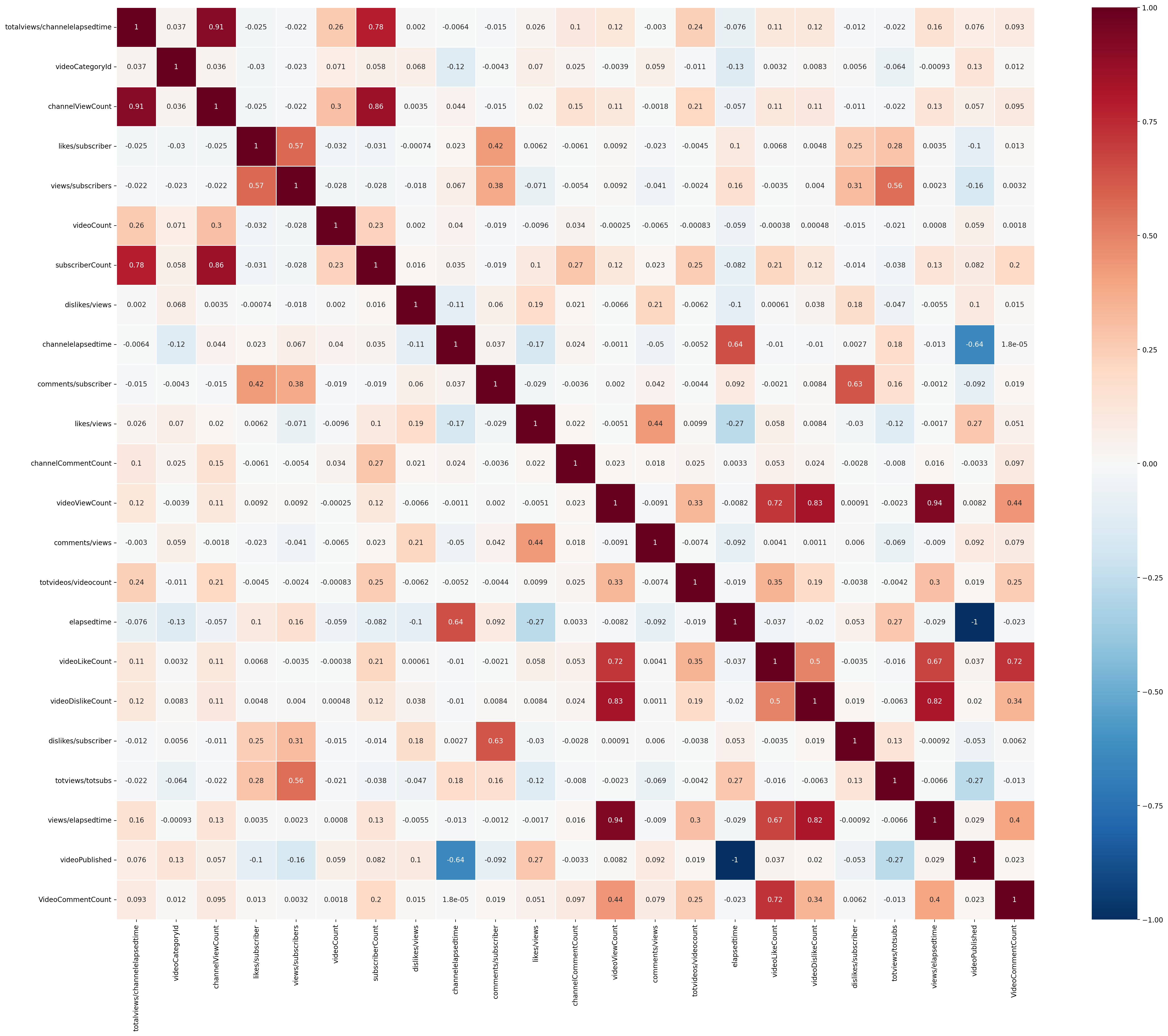
2. Calculate Correlation
Use min-max scaling to normalization
Calculate Pearson correlation coefficient correlations
Correlation
Correlation Heatmap With Annotation
3. Scatter Plot Between Two Attributes
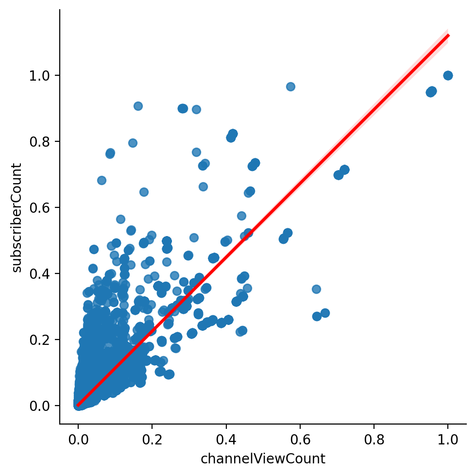
ChannelViewCount and SubscriberCount
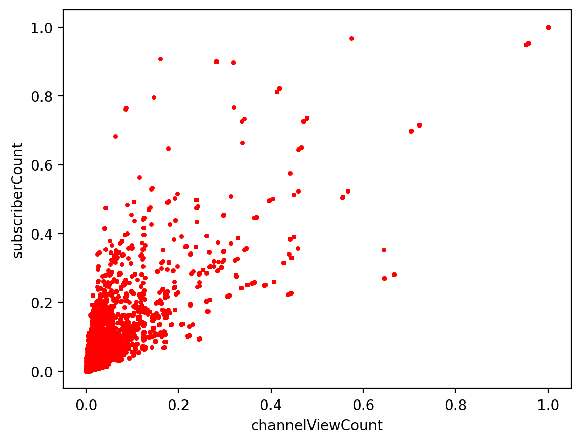
ChannelViewCount and SubscriberCount With Correlation
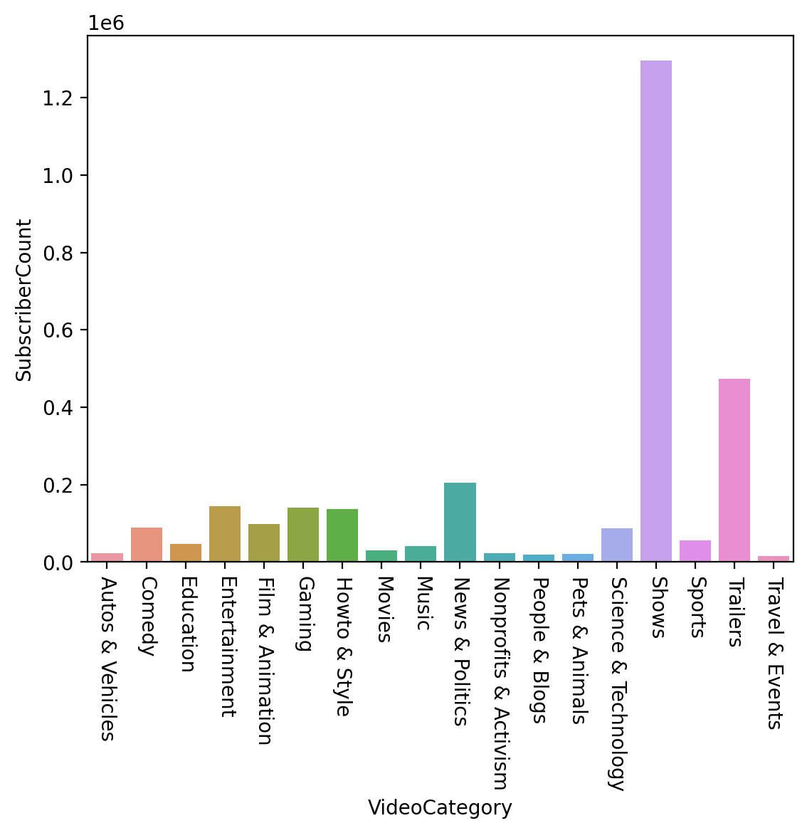
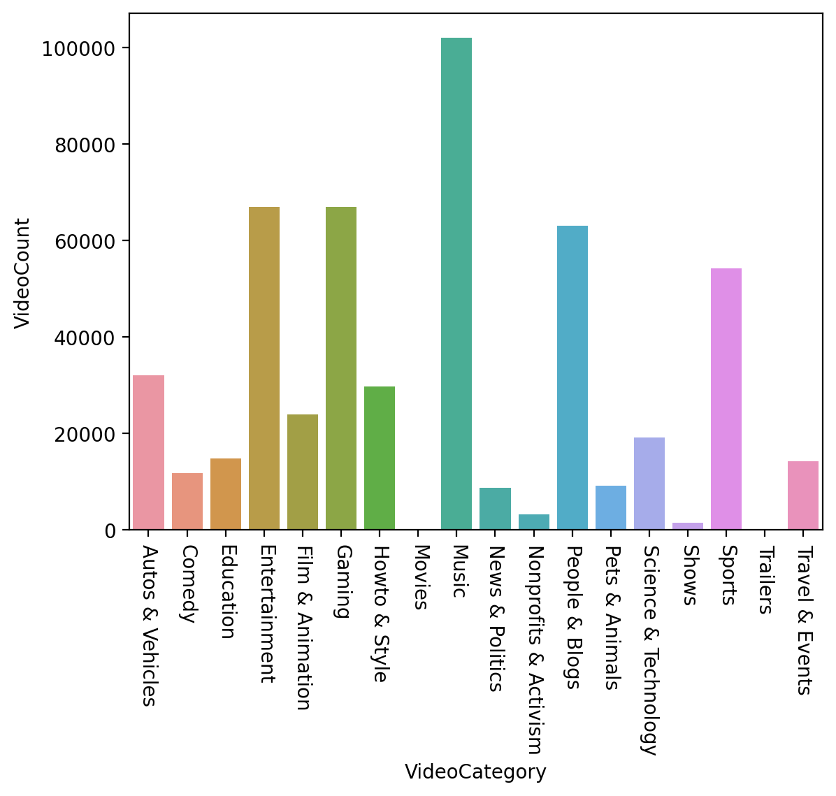
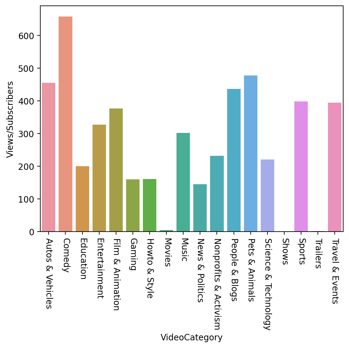
4. Analysis by VideoCategory and Bar Chart
Add attribute ‘videoCategory’ by ‘videoCategoryID’
Group by VideoCategory
SubscriberCount
VideoCount
Views/Subscribers
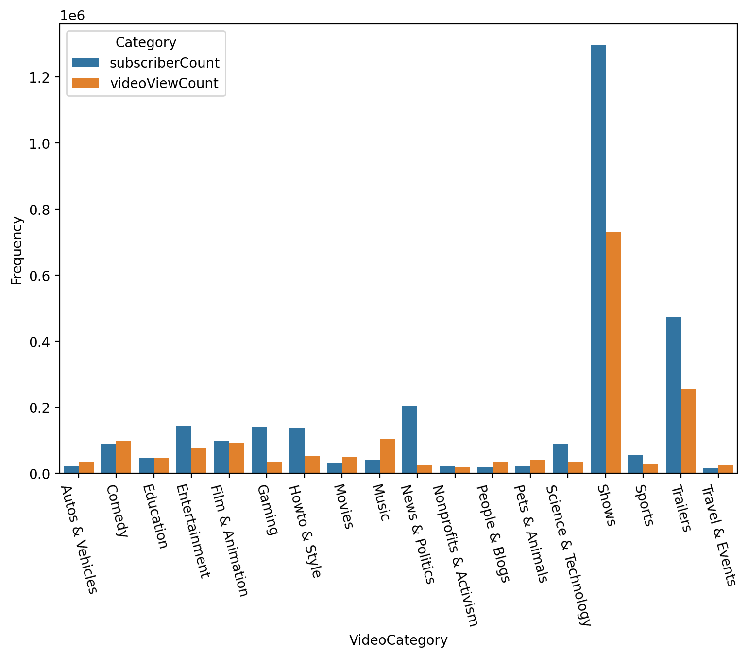
SubscriberCount and VideoViewCount
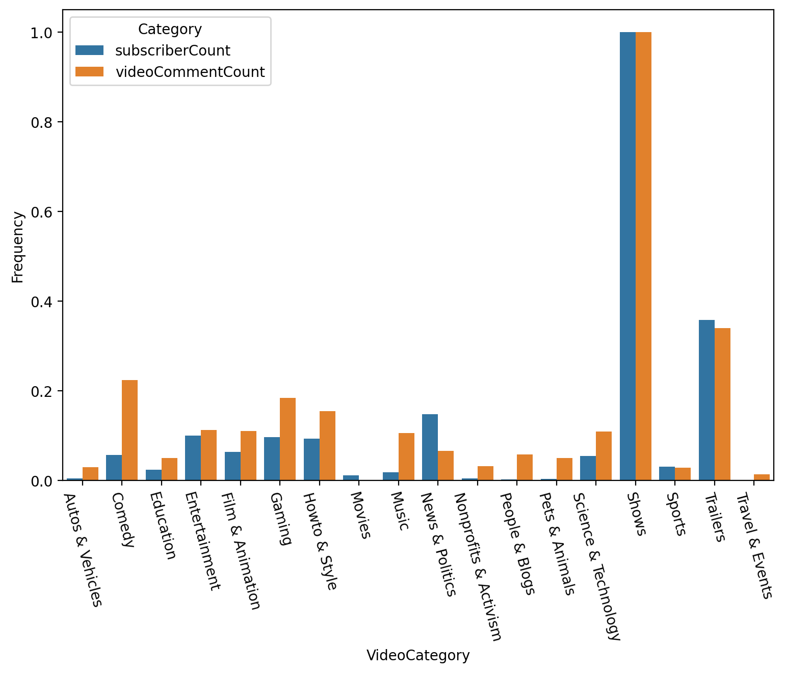
SubscriberCount and VideoCommentCount
Functions
Draw Heatmap
1
2
3
4
5
6
7
8
9
def draw_heatmap(data):
# Use minmax to normalize (value between 0 ~ 1)
normalizedDF_minmax = (data - data.min()) / (data.max() - data.min())
normalizedDF_correlation = normalizedDF_minmax.corr()
plt.figure(figsize=(30, 24))
sns.heatmap(normalizedDF_correlation, cmap='RdBu_r', linewidths=0.5, vmin=-1, vmax=1, annot=True)
plt.show()
draw_heatmap(data)Draw Scatter Plot
1
2
3
4
5
6
7
8
9
10
def draw_scatter(data, attributeName1, attributeName2):
# Use minmax to normalize (value between 0 ~ 1)
attribute1_minmax = (data[attributeName1] - data[attributeName1].min()) / (data[attributeName1].max() - data[attributeName1].min())
attribute2_minmax = (data[attributeName2] - data[attributeName2].min()) / (data[attributeName2].max() - data[attributeName2].min())
plt.scatter(list(attribute1_minmax), list(attribute2_minmax), s=3, c='red')
plt.xlabel(attributeName1)
plt.ylabel(attributeName2)
plt.show()
draw_scatter(data, 'channelViewCount', 'subscriberCount')Draw Scatter With Line
1
2
3
4
5
6
7
8
9
10
11
12
def draw_scatter_with_line(data, attributeName1, attributeName2, x, y):
# Use minmax to normalize (value between 0 ~ 1)
attribute1_minmax = (data[attributeName1] - data[attributeName1].min()) / (data[attributeName1].max() - data[attributeName1].min())
attribute2_minmax = (data[attributeName2] - data[attributeName2].min()) / (data[attributeName2].max() - data[attributeName2].min())
plt.scatter(list(attribute1_minmax), list(attribute2_minmax), s=3, c='red')
plt.plot(x, y)
plt.xlabel(attributeName1)
plt.ylabel(attributeName2)
plt.show()
x = np.linspace(0, 1); y = x
draw_scatter_with_line(data, 'channelViewCount', 'subscriberCount', x, y)Draw Scatter With Correlation
1
2
3
4
5
6
7
8
9
10
11
12
13
14
def draw_scatter_with_correlation(data, attributeName1, attributeName2):
# Use minmax to normalize (value between 0 ~ 1)
attribute1_minmax = (data[attributeName1] - data[attributeName1].min()) / (data[attributeName1].max() - data[attributeName1].min())
attribute2_minmax = (data[attributeName2] - data[attributeName2].min()) / (data[attributeName2].max() - data[attributeName2].min())
df = pd.DataFrame({
attributeName1: list(attribute1_minmax),
attributeName2: list(attribute2_minmax)
})
sns.lmplot(x=attributeName1, y=attributeName2, data=df, line_kws={'color': 'red'})
plt.xlabel(attributeName1)
plt.ylabel(attributeName2)
plt.show()
draw_scatter_with_correlation(data, 'channelViewCount', 'subscriberCount')